Strong, clear typography is no longer a luxury. In 2026 it is a core ranking and conversion factor.
When visitors land on your website, the first few seconds decide whether they stay or leave.
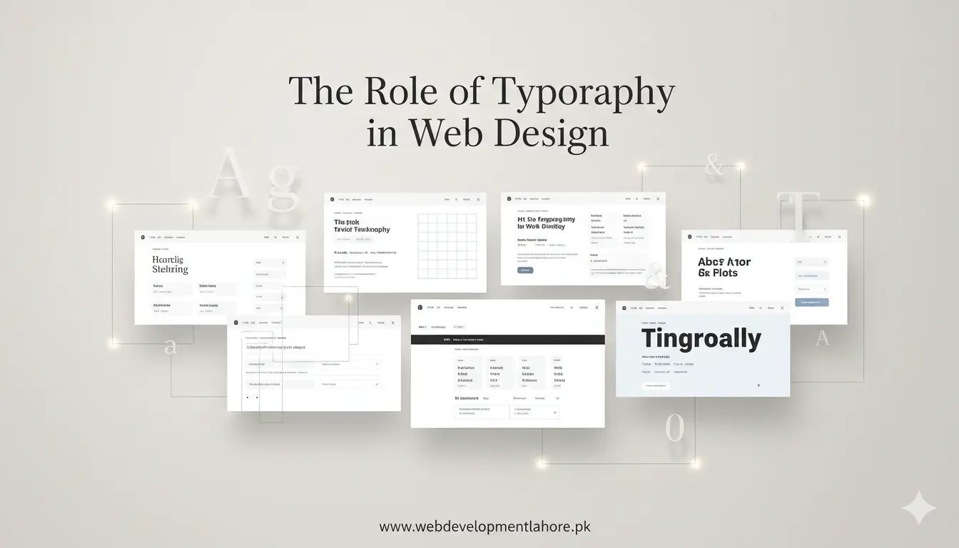
Font size, line height, and contrast guide the eye, shape brand mood, and even influence how Google judges page quality.
As a Lahore-based web design company, WDL studies every letter so our clients gain faster engagement and higher sales.
Why Typography Matters for Modern Websites
- First impression: Clean fonts signal professionalism while cluttered text pushes users away.
- Brand personality: A fintech startup needs authority; a café needs warmth. Type gives that voice.
- Readability and retention: Easy-to-scan copy keeps bounce rate low and dwell time high.
- SEO edge: Google’s Helpful Content System rewards pages that users actually read, share, and trust.
Key Typographic Principles Every Designer Should Know
1. Hierarchy
Use heading tags (H1–H6) in logical order. Bigger, bolder text tells readers what matters first, improving navigation for both people and search bots.
2. Contrast
Make sure text stands out from the background. WCAG 2.2 recommends a minimum 4.5:1 ratio for body copy. High contrast boosts accessibility scores and keeps the site compliant.
3. White Space
Generous margins and padding give words room to breathe. This lowers cognitive load, especially on mobile devices, where cramped text feels overwhelming.
4. Consistency
Limit your project to two or three typefaces. Consistent font families build brand recall and reduce download time, helping Core Web Vitals.
5. Responsiveness
Fluid typography scales with viewport width. A base size of 16px on desktop and 14-15px on smaller screens maintains clarity without zoom.
Choosing the Right Fonts for Your Brand
The best font is the one that aligns with your business goals. When WDL consults companies in Lahore and across Pakistan, we run a quick checklist:
- Industry fit: Serif fonts convey tradition; sans serif shows modernity; display fonts add personality.
- Loading speed: System fonts or variable fonts reduce HTTP requests, improving performance.
- Licensing: Always pick legally safe fonts, especially for e-commerce sites that may scale globally.
- Pairing: Use complementary styles—such as a bold header font with a neutral body font—to create contrast without chaos.
Typography and User Experience (UX)
Great UX starts with legibility. Research carried out by international UX groups in 2025 proved that users read 23% faster when line length stays between 50 and 75 characters.
At WDL we apply this rule to product pages, landing pages, and blog posts so users finish tasks quickly and feel satisfied.
SEO Benefits of Good Typography
- Lower bounce rate: Readable text keeps visitors longer, a signal Google’s RankBrain notices.
- Higher dwell time: Engaging copy increases on-page duration, leading to better SERP positions for competitive terms like “web design services in Lahore”.
- Featured snippets: Clear headings and lists help search engines extract answers, boosting click-through rate.
Accessibility and Responsive Typography
Pakistan’s digital market has grown by 62% since 2024, and diverse audiences now browse with screen readers, tablets, and low-bandwidth phones.
Follow these steps to make sure everyone can read your content:
- Adopt relative units such as
reminstead of pixels for scalable fonts. - Maintain proper line height (1.4–1.6) for smoother eye movement.
- Enable user font resizing via browser settings by not locking type sizes in CSS.
- Add skip links and ARIA landmarks so screen readers find major sections quickly.
Common Mistakes to Avoid
- Overloading with fancy fonts: They slow pages and confuse readers.
- Ignoring mobile testing: A stylish desktop layout can break on a 5-inch screen.
- Inconsistent spacing: Uneven margins look unprofessional and reduce trust.
- Low contrast on banners: Light gray text on white kills conversions.
How WDL Implements Effective Typography
Web Development Lahore blends design sense with data. Every project goes through our in-house checklist:
- Brand workshop: We map tone, audience, and competitor fonts.
- Prototype testing: A/B tests validate font size and spacing before launch.
- Performance audit: We preload critical fonts and convert them to WOFF2 for speed.
- Ongoing optimization: Quarterly reviews adjust typography based on analytics and user feedback.
Need help refining your site’s typography or complete web development in Lahore?
Call our team on +92 323 958 7877 for a free consultation.
Key Takeaways
- Typography shapes brand identity and user trust.
- Readable, responsive fonts boost SEO and conversion rates.
- Follow hierarchy, contrast, and consistency to keep visitors engaged.
- Partner with a skilled agency like WDL to integrate best practices without hassle.
Good typography is silent success. When done right, no one notices—users simply enjoy the experience and convert.
Invest in your fonts today and watch your digital presence grow tomorrow.