")
")
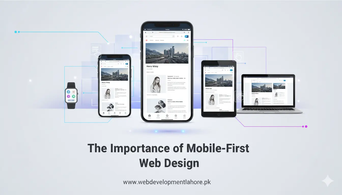
Why Mobile-First Matters in 2026
The Growth of Mobile Traffic in Pakistan
PTA data shows that smartphone penetration crossed 66 % nationwide in early 2026, driven by affordable 5G plans. Lahore alone added three million new mobile broadband users last year. This huge audience expects fast, touch-friendly sites that load in under three seconds. A desktop-only layout simply cannot meet these expectations.
Google’s Mobile-Only Indexing
Since Google switched to mobile-only indexing in late 2025, its crawler now reviews the mobile version of every site first. Pages that fail Core Web Vitals on mobile see an instant drop in visibility. Responsive design helps, but a mobile-first build gives you a clear edge in speed and UX scores.
Key Benefits for Businesses in Lahore
- Higher conversion rates – Mobile shoppers convert up to 40 % better on touch-optimized layouts with clear CTAs and one-tap checkout.
- Improved local SEO – A fast mobile site with location signals (for example, “web services in Gulberg, Lahore”) ranks higher in local packs and Map results.
- Lower bounce rate – Lightweight pages reduce data usage, an important factor for prepaid users across Pakistan.
- Future-proof design – A mobile-first codebase scales naturally to tablets, foldable screens, and desktops, saving redesign costs later.
- Positive brand image – Smooth mobile experiences show customers that your company values their time and comfort.
How Mobile-First Impacts Search Engine Ranking
Google evaluates three main signals on mobile: page speed, visual stability, and interactivity. A mobile-first site meets these standards by default:
- Smaller HTML and CSS files shorten Time to First Byte (TTFB).
- Adaptive images load the right resolution for each screen, cutting bandwidth.
- Clean, semantic markup helps Google understand content and rich snippets.
When these elements align, your site climbs higher in search results for keywords like “best digital marketing agency in Lahore” or “e-commerce website development Pakistan.”
Core Principles of Mobile-First Web Design
- Progressive enhancement – Start with the simplest layout for a 360 px screen, then add features for larger displays.
- Flexible grid systems – Use percentage-based columns and CSS Grid so content adapts smoothly.
- Touch-friendly navigation – Buttons should be at least 44 × 44 px; menus must be reachable with one thumb.
- Performance budgeting – Keep every page under 500 KB by compressing images and minifying scripts.
- Accessible design – Contrast ratios, readable fonts, and alt text help all visitors, including those with disabilities.
Common Mistakes to Avoid
- Using desktop pop-ups that cover the entire mobile screen.
- Loading heavy carousels or background videos on 3G connections.
- Hiding important content on mobile versions, which hurts SEO.
- Over-relying on frameworks without manual performance tuning.
- Ignoring real device testing; emulators miss many touch issues.
Steps to Implement a Mobile-First Strategy
- Aim for clear goals – Identify the top action you want users to take on mobile, such as booking a service or calling your office.
- Create wireframes – Sketch the mobile layout first; arrange content in a single column with visible CTAs.
- Develop with modern stacks – At WDL we use Next.js, Tailwind CSS, and Laravel API endpoints for fast rendering.
- Optimize media – Apply WebP and AVIF formats for images and serve adaptive widths via
srcset. - Test on real networks – Measure performance over 4G and slower rural networks common across Punjab.
- Iterate based on analytics – Review heatmaps and session replays to refine navigation and form fields.
Case Study: A Lahore Retailer Boosts Mobile Sales by 53 %
A Gulberg-based clothing brand approached Web Development Lahore after seeing high cart abandonment on mobile. The WDL team rebuilt their store using a mobile-first approach, replacing large hero images with compressed WebP files and adding Apple Pay and Easypaisa one-tap checkout options. Result: page load time fell from 8 s to 1.9 s, and mobile revenue jumped by 53 % within three months.
Why Choose Web Development Lahore (WDL) for Mobile-First Web Design
Our Lahore-based team has crafted over 600 responsive and mobile-first websites across Pakistan, the UAE, and the UK. We combine SEO, UX design, and performance engineering to build sites that not only look good but also rank and sell. Whether you need a corporate portal, an e-commerce shop, or a custom web app, WDL delivers on time and within budget.
Ready to make your site mobile-first and future-proof? Talk to our experts today at +92 323 958 7877 or visit webdevelopmentlahore.pk.