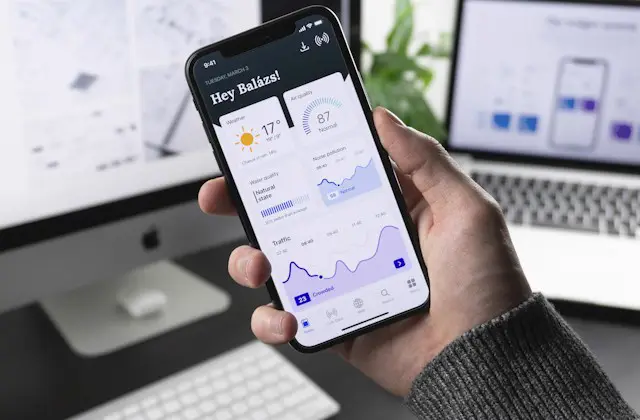
Most of your customers will see your website on a phone, often a budget Android on mobile data. We design and build responsive websites that look sharp, load fast and stay easy to use on every screen, from a 5 inch phone to a 27 inch monitor.
 7 sizestested before launch
Responsive web design means one website whose layout, images and navigation rearrange themselves to fit the screen in front of them. No zooming, no sideways scrolling, no tiny buttons.
In Pakistan this is not a nice extra. Smartphones are how most people get online, and Google now uses the mobile version of a page to decide how it ranks (mobile-first indexing). If your site is hard to use on a phone, you lose the visitor and you lose ranking at the same time.
We design mobile-first: we plan the phone layout first, then expand it for tablets and desktops. That order forces clear priorities: the headline, the offer, the call and WhatsApp buttons. Everything that does not help a customer decide is cut or moved lower.
If it does not work on a Rs 30,000 Android phone on 4G in Lahore, it does not work.
From brand new builds to fixing a desktop-only website that loses mobile visitors.
New websites planned for phones first and expanded for larger screens, so the mobile experience is never an afterthought.
We rebuild the layout of desktop-only or broken mobile websites while keeping your content, URLs and Google rankings.
Product grids, filters, cart and checkout that are easy to use with one thumb, including COD and wallet payments.
WebP images, lazy loading, lighter scripts and caching to pass Core Web Vitals on mobile data.
Clear mobile menus, sticky call and WhatsApp bars and forms that open the right keyboard for phone numbers and emails.
A full audit of your current site on real phones, tablets and laptops, with a prioritised list of fixes.
This checklist runs on every page before a site goes live. You get a copy with your handover.
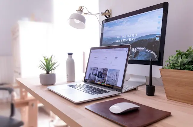
We test on real devices common in Pakistan, not only in a desktop browser.
| Screen width | Typical device | What we check |
|---|---|---|
| 360px | Budget Android (Infinix, Tecno, Samsung A series) | Text size, buttons, no sideways scroll |
| 390 to 412px | iPhone and mid-range Android | Hero, menus, sticky WhatsApp bar |
| 768px | Tablets, phones in landscape | Two column grids, tables |
| 1024px | Small laptops, iPad landscape | Navigation switch point |
| 1366px | Most office laptops | Full desktop layout |
| 1920px | Large monitors | Maximum width, image sharpness |
The same process works for new websites and for fixing existing ones.
We open your site or competitor sites on real phones and record what breaks and what slows visitors down.
Phone layouts are planned first, deciding what each visitor must see before scrolling.
Designs for phone, tablet and desktop are shared in Figma for your approval.
Flexible grids, responsive images and breakpoints are built in clean CSS, without heavy page builders where possible.
Every page is tested at all screen sizes and checked with PageSpeed Insights.
We launch, watch Search Console mobile reports and fix anything Google flags.
There are three ways to serve mobile visitors. For almost every business, responsive is the right choice.
| Responsive design | Adaptive design | Separate mobile site (m.) | |
|---|---|---|---|
| How it works | One layout that flexes to any screen | Fixed layouts for a few set sizes | A second website for phones |
| SEO | Best, one URL per page | Good | Risky, duplicate content and redirects |
| Maintenance | Update once | Update several layouts | Update two websites |
| Cost | Included in our packages | Higher | Highest |
| Our advice | Recommended | Special cases only | Avoid |
Open these on your phone to see how they adapt.
Yes. Every website we build, from the Rs 29,000 theme package upward, is fully responsive and tested on phones, tablets and desktops at no extra cost.
Usually yes. We first run a free mobile audit. If the site is on WordPress we can often fix the layout without a full rebuild. If the code is very old, a redesign is cheaper in the long run.
Google ranks pages using their mobile version. A responsive site gives Google one URL with the same content on every device, which is the setup Google recommends.
Open it on your phone. If you need to zoom, scroll sideways or the buttons are hard to tap, it is not properly responsive. Google PageSpeed Insights will also show mobile problems.
A mobile-friendly site works on phones. A responsive site adapts smoothly to every screen size, including tablets and large monitors, from one design.
Not when it is built properly. We serve smaller WebP images to phones, lazy load content below the fold and remove heavy scripts, aiming for under 2.5 seconds to show the main content.
Yes. Dashboards, portals and booking systems get the same mobile-first treatment, planned with our UI/UX design team.
Real Android phones and iPhones, Chrome device tools, Google PageSpeed Insights, Lighthouse and Search Console reports.
 Not sure what you need?